

Accessibility and performance are not separate technical extras. Both determine whether people can understand, navigate and act on your website. A fast page that excludes keyboard users is not effective; an accessible page that takes too long to load still creates barriers.
- The four WCAG accessibility principles
- Practical design, content and development checks
- How performance and accessibility reinforce conversion
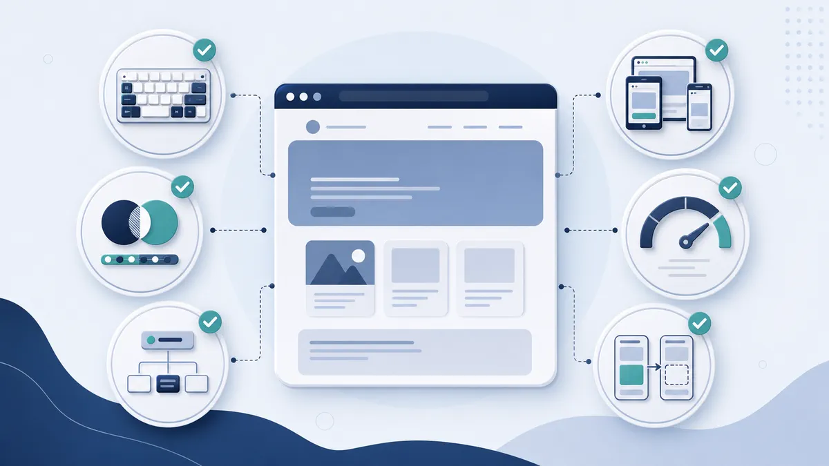
Understand the four accessibility principles
WCAG organises accessibility around four principles: perceivable, operable, understandable and robust. In practical terms, people need to receive the information, operate the interface, understand the content and use it with different browsers and assistive technologies.
WCAG 2.2 is a stable international standard with testable success criteria at levels A, AA and AAA. Automated tools are useful, but they cannot replace manual review and testing with people.
Make content perceivable
Provide meaningful alternative text for informative images and leave decorative images with empty alt attributes. Add captions and transcripts where appropriate. Use sufficient colour contrast and never rely on colour alone to communicate status.
Allow text to resize and reflow without hiding content or controls. Keep important words out of images so they remain adaptable and available to assistive technology.
Make every interaction operable
Visitors should be able to use navigation, menus, forms, modals and carousels with a keyboard. Focus indicators must be visible and follow a logical order. Avoid keyboard traps and provide a way to skip repeated navigation.
Touch targets need adequate size and spacing. Motion should respect user preferences, and moving content needs suitable pause or stop controls when required.
Make the experience understandable
Use direct headings, familiar controls and consistent navigation. Form fields need visible labels, useful instructions and error messages that explain how to correct the problem. Do not clear completed fields after an error.
Plain language helps everyone, including busy visitors, people reading in a second language and users with cognitive impairments.
Build robust foundations
Use semantic HTML before adding ARIA. Correct headings, buttons, links, lists and form elements provide reliable meaning across browsers and assistive technologies. Test dynamic components with keyboard and screen-reader workflows.
Measure the user experience, not only a score
Core Web Vitals focus on loading, responsiveness and visual stability. Use field data where available because it reflects real devices and networks, then use laboratory tools to diagnose problems. A perfect score is not the objective; a consistently responsive experience is.
Optimise the largest content
Compress and correctly size hero and product images, serve modern formats where appropriate and avoid lazy-loading the primary above-the-fold image. Reduce render-blocking resources and prioritise what is needed for the initial view.
Reduce interaction delay
Large JavaScript tasks and excessive third-party scripts can make a page appear ready while controls remain unresponsive. Remove unused code, split long tasks and challenge every analytics, chat and marketing script to justify its cost.
Prevent layout movement
Reserve dimensions for images, embeds and banners. Avoid inserting content above what the visitor is reading, and load fonts in a way that limits disruptive shifts. Stable pages improve confidence and reduce accidental clicks.
Use a layered testing process
- Run automated accessibility and performance checks.
- Navigate every template using only a keyboard.
- Review zoom, reflow, contrast and visible focus.
- Test important journeys with a screen reader.
- Test forms and error recovery.
- Review real-user performance after launch.
- Include people with disabilities in usability testing where possible.
Make improvement continuous
Accessibility and performance can regress when teams add content, plugins, campaigns or third-party tools. Add checks to publishing workflows, define ownership and repeat audits after meaningful changes. An accessibility statement should accurately describe current conformance, known limitations and contact routes rather than making an unsupported promise.
Frequently asked questions
Can an automated plugin make a website accessible?
No single plugin can correct content decisions, keyboard behaviour, semantics and every interaction. Tools can support testing, but accessibility requires considered design, development, content and ongoing review.
Does website speed affect conversions?
Speed influences whether visitors can reach and use the experience. The commercial effect varies, so measure your own journeys, but faster and more stable pages remove avoidable friction.
Create an accessibility baseline
Select representative templates and journeys: homepage, navigation, service or product pages, search, forms, checkout, account areas and documents. Run automated checks, then complete keyboard, zoom, reflow and screen-reader reviews. Record the issue, affected users, WCAG reference, severity, location, evidence and recommended fix.
Prioritise blockers that prevent a journey, followed by repeated component defects. Fixing one inaccessible menu component may improve every page. Do not report only an automated score; it can miss whether a real person can complete the task.
Design for keyboard and focus
Every interactive control must be reachable and usable without a mouse. Focus order should follow the visual and logical sequence. Visible focus needs sufficient contrast and must not be hidden by sticky headers or overlays. Menus, dialogs and carousels require deliberate keyboard behaviour.
Use native buttons for actions and links for navigation. Avoid clickable generic containers. When a dialog opens, move focus appropriately, keep it within the dialog when required, support Escape and return focus to the trigger on close.
Improve forms beyond labels
Associate every input with a persistent label and group related choices with fieldsets and legends. Provide format guidance before submission. Error messages must identify the field, explain the problem and remain available to assistive technology. Keep valid data after an error and provide a summary when forms are long.
Do not use placeholder text as the only label. Confirm successful submission clearly and explain what happens next. Test autofill and password managers rather than disabling them without a strong reason.
Choose accessible content patterns
Use headings to describe structure, not to achieve a visual size. Write descriptive link text that makes sense out of context. Tables need headers and should be used for data, not layout. Documents should be accessible or replaced with well-structured web content when possible.
Alternative text depends on purpose. Describe informative images concisely, provide equivalent detail for charts and leave decorative images empty. Do not repeat nearby captions or begin every description with “image of”.
Control third-party risk
Cookie tools, chat widgets, booking systems, maps, video players and payment components can introduce accessibility and performance defects. Evaluate them before adoption, include requirements in procurement and retest after updates. Provide an accessible alternative when a necessary service has a limitation.
Third-party scripts also compete for the main thread and network. Load them only where needed, defer non-essential features and remove tools that no longer produce value.
Build a performance budget
Set practical limits for image weight, JavaScript, fonts and third-party requests on key templates. A budget turns performance into a design and publishing constraint rather than a late optimisation exercise. Review it in development and monitor real-user data after launch.
Optimise the largest visible element, reduce long JavaScript tasks and reserve dimensions for media. Use caching and a capable hosting configuration, but do not expect hosting alone to compensate for oversized pages.
Test across realistic conditions
Laboratory tools are repeatable and useful for diagnosis. Field data shows what real visitors experience across devices and networks. Use both. Test mid-range mobile hardware, slower connections, zoom, large text and reduced motion. Include authenticated or checkout journeys that public tools cannot reach.
Performance can vary by page type, geography and consent choice. Measure representative pages rather than relying on one homepage score.
Create accessible publishing governance
Give content editors guidance for headings, links, images, tables, video and documents. Configure the CMS to encourage safe defaults. Add accessibility and performance checks to definition-of-done criteria, QA and release reviews. Assign owners and deadlines to defects.
Publish an accurate accessibility statement describing the standard used, assessment method, known limitations and contact route. Review it when the website changes. A statement is useful accountability, not proof that barriers do not exist.
Accessibility and performance questions
Is WCAG AA always the appropriate target?
WCAG 2.2 AA is a widely used practical target, but legal and contractual requirements vary. Confirm obligations for the organisation and market.
Can accessibility reduce design quality?
No. Clear hierarchy, contrast, focus and predictable interaction usually improve design. Constraints encourage better decisions.
Should every image have descriptive alt text?
No. Informative images need an equivalent; decorative images should normally have empty alt text so they are skipped.
How often should audits happen?
Test during design and development, before launch, after major changes and on a recurring schedule. Continuous checks prevent regressions more effectively than occasional audits.
Assign severity to accessibility findings
Use a consistent model based on user impact, journey importance, frequency and reach. A keyboard trap in checkout is critical because it blocks completion. Missing alternative text on one decorative-adjacent image is lower priority, though still worth correcting. Repeated component issues should be fixed at the source rather than patched page by page.
Include evidence and acceptance criteria in every ticket. Developers need the expected keyboard behaviour, accessible name or announcement—not only a screenshot of a tool warning. Retest with the same method after remediation and check that the fix did not create a new barrier.
Include accessibility in design reviews
Review colour contrast, focus, target size, reflow, motion and content hierarchy before development. Annotate interaction states and keyboard expectations in design files. Use realistic content because long labels, errors and zoom expose weaknesses that polished mock-ups can hide. Designers and developers should review complex components together.
Do not use an accessibility overlay as a substitute for correcting the website. User controls can be helpful when designed well, but they cannot repair underlying semantics, keyboard behaviour or inaccessible third-party processes.
Optimise media responsibly
Resize and compress images for their displayed context, provide responsive variants and avoid loading off-screen media immediately. Supply captions, transcripts or audio description when required by the content. Give users control over autoplay and respect reduced-motion preferences. Decorative video should not consume bandwidth needed for the primary task.
Choose formats based on support and content rather than fashion. Verify visual quality and fallback behaviour. Performance work must not remove information or controls needed by assistive technology.
Monitor after every meaningful release
Track real-user performance by template and device, automated accessibility checks and error monitoring. Add manual regression checks for navigation, dialogs, forms and checkout. Review new content samples because editorial changes can introduce skipped headings, weak links, inaccessible documents or oversized images.
Create an escalation route for accessibility feedback and respond respectfully. A reported barrier is valuable usability evidence. Record the resolution and consider whether the same pattern exists elsewhere.
Build an inclusive improvement roadmap
First remove blockers in priority journeys. Next fix shared components and templates, then improve content and lower-frequency pages. Add preventive standards, training and procurement requirements alongside remediation. Set dates and accountable owners.
Include disabled people in research and usability testing when possible, and compensate participants appropriately. Their experience reveals barriers that conformance checks cannot. Treat that insight as product expertise, not a ceremonial final review.
Accessibility and performance release checklist
Before release, test priority journeys using a keyboard, zoom, reflow and at least one screen reader workflow. Verify headings, landmarks, labels, errors, status messages, focus management, contrast and motion. Review images, video, documents and third-party tools. Run performance tests on representative pages and compare real-user measures after deployment. Confirm that monitoring does not expose personal or sensitive information.
Document known limitations with owners and target dates. Provide an accessible contact route for feedback and ensure the team knows how to respond. If a third-party barrier cannot be fixed immediately, offer a practical alternative rather than relying only on a disclaimer.
What makes improvement sustainable?
Sustainable quality comes from reusable accessible components, performance budgets, trained editors, procurement requirements and regular regression testing. Include these responsibilities in normal product work. When inclusion and speed are part of every release, remediation becomes smaller, less disruptive and more effective.